Beyond the screen: Designing the
EYE TRACKING ECOSYSTEM
@ Tobii AB
MY ROLE: SR. UX & SERVICE DESIGNER
TIME: 2.5 years + | TOOLS: Strategy and business canvases/ workshops, Qualitative & Quantitative research methods, Service Blueprint, Figma, Miro, Jira, Communication tools | TEAM: Product Managers, Product owners, hardware & software development teams, Other UX-UI designers and stakeholders
ABOUT THE BRAND
Tobii, a world leader in eye tracking technology, offers insights into human attention across various industries like automotive, research and and human-computer interaction. It’s wearable eye‑tracking glasses are widely respected tools for capturing real‑world visual behavior, especially in academic, UX, consumer research, sports, and industrial settings.

MY ROLE
As a Senior product and service Designer, I led the end-to-end experience design for the Tobii Glasses X ecosystem, a flagship product and service offering. The solution had to live up to Tobii's reputation for high data accuracy while providing a modern, intuitive user experience.
A systems thinking approach was applied to integrate the eye-tracking glasses, Android app, and the Glasses Explore cloud platform to deliver a cohesive and effective solution. This involved not only crafting a minimalistic and intuitive UI for the Android app but also identifying and bridging the gaps and tacking the complexity of processes between different teams and stakeholders, such as customer success, sales, and product management.
This B2B SaaS offering empowers over 1500+ businesses to gather real-world attention data, gain trusted insights, and make data-driven decisions that enhance productivity and quality. Throughout the process, I strategically integrated product design principles with cutting-edge technology, championing a user-centric and ecosystem mindset to ensure a seamless and valuable experience.
The ecosystem
USER AND BUSINESS CHALLENGES
The insights gathered from the research were very important in shaping the requirements for current and future product experiences, as they highlighted some key challenges for users and the business.
01
Reliability:
Persistent connectivity and syncing issues across devices.
02
Usability:
Inconsistent, clunky UI and a steep learning curve for both data collection and analysis, making eye-tracking seem overwhelming.
03
Trust & Efficiency:
Concerns about data accuracy and quality, coupled with a time-consuming workflow.
04
Engagement:
Low perceived user engagement and retention (indicated by sales feedback).
05
Lack of customer focus:
Limited customer focus internally and a lack of UX process and research buy-in
Through an initial Discovery phase, product management defined a broad long-term ecosystem vision. This vision included two primary phases of development:
-
Phase 1: Improve the project management and analysis experience of managers and analysts through a new cloud based analysis tool
-
Phase 2: Improve the field experience of participants and moderators through the development of the new eye tracking Glasses, connected to an Android app
Combining the insights from my research with this product vision gave us a clear direction for the ecosystem experience, it’s features and functionality
MY HOLISTIC DESIGN APPROACH
To create a cohesive and impactful experience across the Tobii Glasses X ecosystem, a multi-level design approach was applied, spanning strategic vision, service orchestration, and product execution. Below is how my efforts were structured:
1. IMPROVISING & EVANGELISING CUSTOMER RESEARCH
Facing limited customer focus and UX support, along with competing priorities, proactively addressing a crucial gap in customer understanding became my main goal. This initiative included creatively gathering feedback from unconventional internal sources, therby securing stakeholder buy-in for customer visits and implementation of other research processes.
My internal ethnographic study, culminating in an engaging 56-minute "user movie," significantly increased company-wide customer awareness. This initiative inspired a strategic shift toward a user-centric approach and became a valuable tool for employee onboarding.
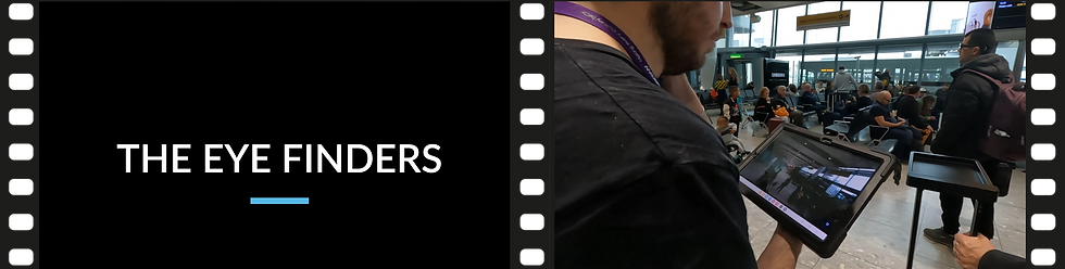
User movie (56 minutes)
2. CREATING USE CASES AND USER RESEARCH REPOSITORIES
User needs model
With multiple overlapping use cases for Tobii Glasses, distinguishing and prioritizing user needs was a significant challenge. For clarity, efficient management and easy prioritization of user needs, we developed a living model that helped to identify our wide array of user groups and their commonalities and differences. It streamlined the prioritization for strategic decisions, ensuring alignment with core user needs for more impactful product development.
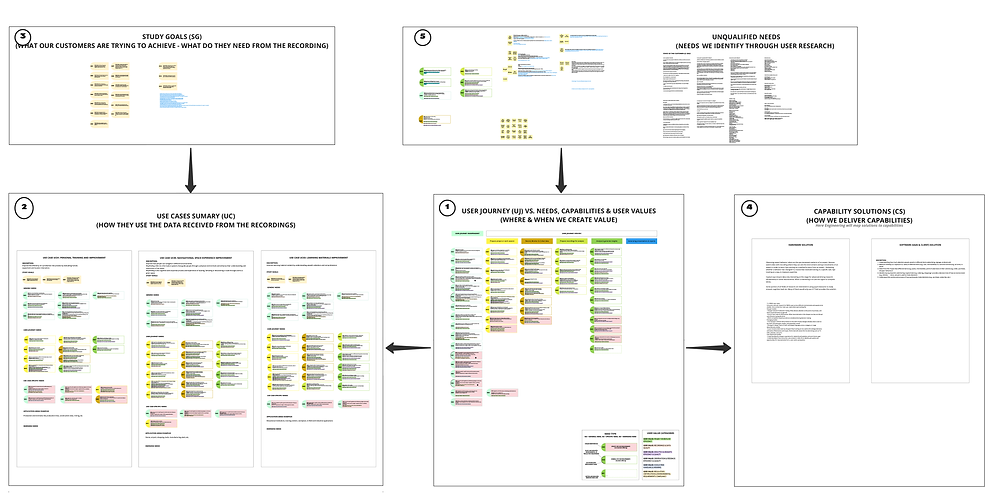
User needs model
Research repository
Creating a centralized research repository in Dovetail with a clear taxonomy made UX insights accessible and actionable across teams. Setting up routines for sharing these insights within the team helped keep the team updated on our latest findings.
3. SHAPING PRODUCT STRATEGY AND IDENTITY
Product and UX requirements
Working closely with product and engineering teams, we leveraged user insights to define the core features and flows for Tobii Glasses X and its app, keeping a sharp focus on technical feasibility and alignment with needs and strategic goals.
Product Personality & Tone of Voice
Our new users weren’t researchers, but a wider audience who valued clarity over complexity. This meant that we needed to move away from technical jargon towards a more friendly tone. I led a cross-functional effort to redefine our communication, moving away from technical, scientific language toward a professional, yet friendly and approachable tone. Through a series of collaborative workshops, we crafted a product personality that reflected our users' needs and mindset. This new voice shaped all touchpoints from the UI and onboarding to our brand and marketing, becoming a core part of how the Tobii Glasses X ecosystem engages with its audience.

Product personality workshop
4. DESIGNING A COHESIVE SERVICE ECOSYSTEM
Service Mapping
What looked like a functional ecosystem on the surface turned out to be fragmented beneath, especially where hardware, software, and support touchpoints intersected across 15+ touchpoints. To bring clarity and alignment, I led the development of a comprehensive service blueprint through 12 stakeholder interviews with sales, customer success, logistics, business operations and engineering teams. The blueprint mapped internal operations and the external user journeys across every interaction revealing 20+ opportunities for process enhancement. It became a powerful alignment tool for cross-functional processes, reduced communication gaps and led to 4 new projects that enhanced the end-customer service experience.
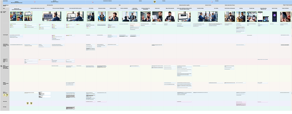
Service blueprint
Creating a comic book of the blueprint helped make the complex map more accessible and engaging especially for the engineering team. This engaged stakeholders and helped facilitate discussions to address these issues and improve workflows across teams.
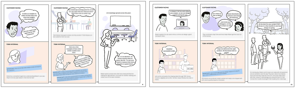
Service blueprint comic book
App & Cloud alignment
Championing systems thinking and taking ownership of the ecosystem experience, I aligned the mobile app and cloud platform roadmaps and streamlined features. This helped the previously siloed teams work together better, creating a unified user experience.
5. BUILDING A SCALABLE PRODUCT FOUNDATION
New design system
Leading the effort to streamline development and unify the ecosystem with a new tone of voice, the team created a design system through close collaboration with designers, developers, and the brand team. Together, gaps were identified, principles aligned, and a scalable system co-created. This resulted in a fresh, modern visual identity and laid the groundwork for faster, more consistent product delivery.
Clean, minimalistic & modern UI
Based on the defined product requirements and a new product personality, I designed a clean and minimalistic UI for the Android app. My goal was to create a seamless and intuitive experience that enhanced the user's workflow and make complex eye-tracking technology feel straightforward and accessible for our broader audience.

App UI
Owning the ecosystem experience involved regularly and thoroughly reviewing the mobile app and cloud experiences for inconsistencies. The focus was on unifying the experience for data collectors and analysts by harmonizing terminology, navigation, and visual design. This included tasks like conceptualising the data model, designing the navigation structure, user role definition etc.
6. TESTING, ONBOARDING AND PERFORMANCE TRACKING
User Testing & Feedback Loops
Regular feedback sessions were held to validate design assumptions and refine user flows during development of both Glasses Explore and mobile app. The focus remained on ‘ease of use’—ensuring seamless connection with the Glasses, effortless uploads, and quick data analysis.
Onboarding
Eye tracking can be intimidating, especially for new users integrating it into existing workflows. To make eye tracking more accessible, we partnered with Customer Success to lead the design of an intuitive, component-based web onboarding. This onboarding experience combined clear content, illustrations, and contextual support to reduce users' learning curve and boost engagement and retention.
Facilitating the identification of KPIs and implementing metrics tracking
Driving the definition of KPIs and the implementation of tracking tools through cross-team collaboration ensured product development aligned with strategic goals. This clear reporting allowed us to monitor progress, make data-driven decisions, and continuously improve products for both users and business targets.

2 different metrics dashboards
Supporting the hardware team
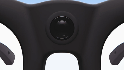
Bringing my knowledge in physical product design, collaboration with the hardware team focused on ergonomic improvements for the Glasses and case, including size and fit testing throughout the development process.
RESULTS & IMPACT
Even without a full end-to-end UX process, my refinements to the ecosystem significantly boosted user satisfaction.
90%
Faster onboarding
Seamless plug-and-play syncing between Glasses X and the app eliminated technical delays, enabling moderators to start recording immediately and reducing frustration.
98%
Reduction in data analysis delays
Automatic cloud uploads cut the wait time for data analysis from 6 hours to 5 minutes. This enabled analysts to start their work instantly, leading to a more efficient workflow and faster, data-driven decisions.
Reduced learning curve
The reduced learning curve reduced user frustration and increased accessibility. This improved adoption and retention and lowered support costs.
Increased engagement, brand connection and interest
A new product voice and visual identity were developed to resonate with our target audience. This cohesive approach across UX writing, Help Center articles, and marketing materials was reported by Sales and Marketing teams to have boosted customer engagement and interest.
Deepend user understanding and confident decision making
Continuous tracking of user and usage metrics gave us a deeper understanding of our users. This data-driven approach allowed us to validate hypotheses and refine assumptions, resulting in greater confidence for the product and development teams when making key decisions.
Enhanced consistency and streamlined cross-platform experience
A new focus on ecosystem thinking led to more collaborative decisions between product and development teams. This improved consistency between the mobile app and cloud platform, enabling a smoother cross-platform experience and reducing cognitive load for users switching between devices.
REFLECTIONS AND LEARNINGS
Designing for a complex ecosystem that combined hardware, mobile, and cloud software highlighted the importance of adaptability and close cross-functional collaboration. Without a formal UX process, resourcefulness became essential—leveraging available data, gathering internal feedback, and working closely with technical teams helped improve the overall user experience.
Cross-Platform Consistency: Achieving consistency across devices presented one of the project’s biggest challenges. I learned firsthand the crucial value of open communication and team alignment is for a smooth collaboration.
Problem-Solving Under Constraints: Tight timelines and a lack of formal structure using my UX problem-solving skills became really important. It was a great learning experience in being resourceful and adaptable, as I consistently applied core UX principles to navigate those constraints and effectively resolve key issues. I practiced tackling complex problems and thinking strategically to ensure the design and the technology felt connected and the user experience felt seamless, no matter the device.
Power of a clear vision: This project truly underscored the value of a clear, unified vision. Aligning long-term business goals with a focus on customer value acts as a compass—guiding confident decision-making and helping the team stay focused on what mattered most. That clarity not only drives internal alignment but also translates into a more intuitive, purposeful product experience.
Magic of a great team: One of the most important highlights of this experience was the strength of the team dynamic. The collaborative culture fostered mutual support, making even high-pressure moments feel manageable—and often, genuinely enjoyable. This collective spirit didn’t just lead to solutions; it created an environment where everyone felt empowered, engaged, and built trust.